Data Visualisation vs Data Analogy

There’s been a lot of discussion during the pandemic about the negative affect of news and general information overload – people being glued to their screens, scrolling through endless updates and sensationalist headlines, and the resulting anxiety and depression that can occur.
One thing we’ve noticed that can either help or hinder the situation is the use of data visualisation. They say that “a picture is worth a thousand words”, but if the analogy presented by the visualisation is poor, or insufficiently explained, it can leave people more confused than ever.
A great example of this was a senior economic analyst for one of the major banks in Australia, who was theorizing on the type of recession we were likely to have as a result of Covid. They referenced the shape of the recessional curve – your typical recession resulting in a V shaped curve, with the uplift equal and opposite to the downturn. Then, there was the W shaped recession (also known as the double dip), where there is a brief reprieve before the economy slips into negative growth for a second time before recovering. There was the dreaded L shape recession, where the initial recession is so severe that it takes many years to recover to trendline growth rates. There is the reverse J, the typical J, the double W … and the list goes on. By the end of what was a reasonably short News spot, I felt like I was watching the wrap up speech of Sesame Street (this episode was brought to you by the Letters U, V and L etc…) and I was none the wiser. A good analogy is a thing of beauty. It can make sense of the unknown by connecting it to the familiar. What was lacking here is of course context and the ability of the presenter to stick to one analogy to keep the message simple and clear.

We have been doing a range of work in data visualisation of late and noticed an increasing trend in its use to articulate certain messages or positioning. Whilst this should be a secondary goal, it’s important to ensure you consider the end user of the data and how you can make sure that your visualisation serves its key purpose of communicating clearly and effectively.
In order to do this, we like to stick to what we see as the 5 golden rules of data visualisation.
- First and foremost, answer a question – If your visualisation leaves people more confused than when they started, it’s missed the point. The key is to provide intuitive insight by visualising a trend or outlier
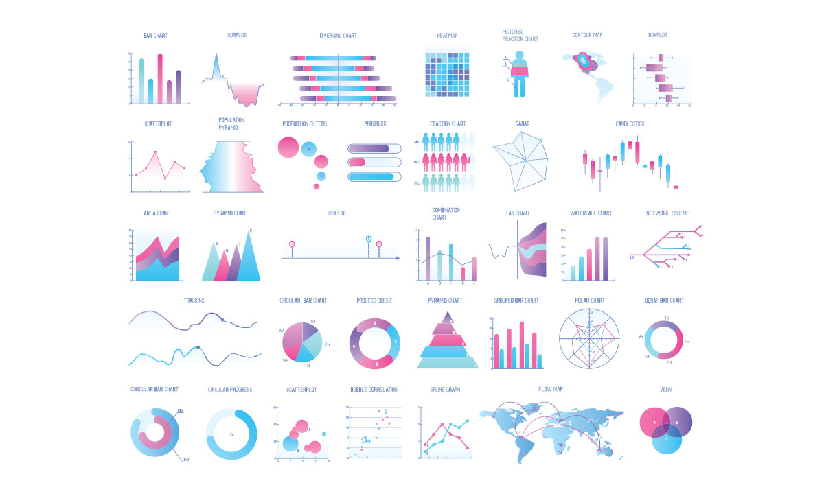
- Use the right visualisation for the right message – Not everything can be solved with a bar chart. Line charts are best at visualising change over time, bar or pie charts end to be used to show relative scale within a category, scatterplot charts are indicative of a relationship between multiple variables.
- Less is always more - don’t overload a chart with data points. The message you are trying to convey will be lost amongst the noise. Indexes are key – make sure the scale of change you are implying is clear by labelling and your indices. This give users understanding of the units of measure you are using. (I see this all the time with weather and particularly swell forecasting, switching between feet and metres for a measure of swell. Since when did we depart from the metric scale?)
- Keep things legible – Simple, clear fonts, applied with calculated scarcity, will keep your message clear and simple. Don’t overdo the design of the data visualisation by getting too tricky with font choice, or overloading data points and messaging on a chart. Take your audience and their likely devices into account, and select a font size that serves the best proportion of your audience well. Don’t overdo elements of design either – keep to simple colour palettes and ensure that text is displayed using an appropriate contrast to the background on which it’s placed.
- Cater to your audience first and foremost – Too often people see data visualisation as an opportunity to present something that is seemingly sophisticated and complex. That is often ignoring the primary needs of the end user, in favour of positioning the author in a self-serving manner. You should take time to understand the key challenges of the end user, understand the where and the why’s of their accessing the data visualisation, and design accordingly.


Proud member of the Deepend Group: